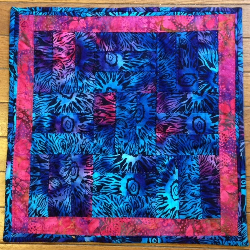
Susan Hill – Contrast – Fire and Ice
In this piece, I’ve chosen to interpret the theme of “Contrast” in color – an electric blue, a very blue red, and colors that mingle the two of them. The heat of the reds and the cold of the blues bring back to me pictures of an eruption a few years ago of Eyjafjallajokull, a volcano in Iceland.
I’ve been experimenting with the nine-patch, one of the basic blocks in quilt design. Here, I’ve alternated vertically-oriented bars with horizontal, to see how that would affect the sense I wanted to convey of wild fire and crashing ice.

Leave a comment
Comments 0