Kaylene Maalste – P
Proportion
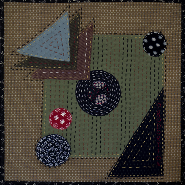
Inspiration: The inspiration for this quilt came from the principles of design which states that proportion adds harmony and symmetry or balance among the parts of a design as a whole. When the principle of proportion is applied to a work of art it is usually in the relationship of size. That is, the size of one element as compared to the size of another related element within the same composition.
The technique of this quilt is similar to the Letter S quilt where I borrowed from the Japanese technique of Boro and Sashiko stitching. The elements of the design are circles and triangles, with a smaller square within the size of the quilt. The word “Proportion” was hand stitched along the long edge of the large triangle. I used fabric from the first quilt and added new colours in this quilt. I machine quilted around the outside edges of the quilt.
Close up View:


This is a great follow-on from your last piece and a good subject choice.I like the colour palette and thread choice. Lovely!
Your quilt is very harmonious and well balanced, and is a good complement to the first one.
A very well worked and technical piece that has a very calm harmony about it. I like the way that the stitching echoes the shapes.
A very interesting and well executed piece. Really nice composition.
This follows on so well from your first piece. It is a clean design showing the Proportion principle that you have made special by the addition of such neat hand stitching. Love it.
Very interesting series. Love your depiction of technical matters of principles and design.
A different interpretation which shows off your mastery of hand stitching in the Japanese tradition. The different sized elements illustrate proportion well, and they work as a whole. The splashes of bright colors, such as the red, enhance the overall effect and add interest.
The chosen colours and shapes are well done. I really like the little red circle.
Your piece really gives me the feeling of balance and proportion. Hand stitching adds to it!
Love your choice of design and your explanation. The little triangles above feel like shadows, floating above the piece. Great color combinations and your hand stitching is superb, well done.
Scale and proportion go hand-in-hand, and you have done a good job of using both. Proportion is something not all quilt artists understand. I like the way you have overlapped shapes to show this, and tht little pop of red goes a long way to help create flow through your quilt.
I love your twist on boro technique. Great composition and choice of color that reminds me so much of Japanese antique textiles. Bravo!
A clean and simple design, yet very well thought out, that is well balanced, harmonious and wonderfully executed!