Bozena Wojtaszek – P
P is for Plums
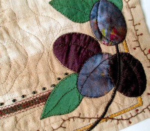
For the letters theme this year I decided to go with illuminated initials for food products. This is a perfect combination of my love for medieval art and food art. And P is for plums.

Detail views:

For the letters theme this year I decided to go with illuminated initials for food products. This is a perfect combination of my love for medieval art and food art. And P is for plums.
Detail views:
This site uses Akismet to reduce spam. Learn how your comment data is processed.
Iina Alho – Norway
Joan Brailsford – United Kingdom
Maryte Collard – Lithuania
Chantal Guillermet – France
Genevieve Guadalupe – USA
Helen Hazon – United Kingdom
Greetje Hein – The Netherlands
Caro Higgs – France
Bella Kaplan – Israel
Kaylene Maalste – Australia
Elsy Menko – Israel
Els Mommers – Dutch Caribbean
Sonia Ruiz – USA
Ann Turley – Unites States of America
Bozena Wojtaszek – Poland

A beautifully illustrated ‘P’. I love the plums and the way you have managed the sheen on them. Lovely.
A very good choice of colours in the true tradition of the medieval manuscripts. I like the unity between your pieces.
A lovely illustrated letter and I like the idea of including plums as part of the illustration, Well done
Your piece really radiates a medieval feeling. I love composition and colours. Beautiful!
Beautiful! I love the theme for your series and this is a brilliant example. The choice of fabric for the letter P is great and your stitched details are just right.
This piece has achieved your goal of looking like a page from an illuminated manuscript. The colour scheme is strong and the letter and the plums stand out. The bold embroidery in strongly contrasting thread has worked well in this piece, and shows off the quality of your handwork.
Very nice. Love the colors you used and the composition you made. The plumbs are well chosen, the blue colors very true. Particularly love your hand stitching in this piece.
This is a beautifully done illustrated letter. The hand embroidery, especially the french knots, are the perfect embellishment.
The fabrics you have chosen work very well. I love the details like the embroidery and the little beads.
It sure looks like a letter from the manuscript. I wish I could touch it with tips of my fingers and feel the texture.
I love the way you illuminated this letter. The plums look delicious… The colors and the details of embroidery and beads are beautiful. Bravo!
The fabric choices, delicate embroidery and embellishments are all spot on and gives your illuminated manuscript letter a true mid evil feel. Well done!
The choice of fabrics and colours is perfect. The creation of the medieval miniature with the plum insert gives the idea of a medical or botanical book. A well-balanced composition in shapes and colours. I love it.