Chantal Guillermet – Series #3 – Complementary : Facing the sea
I really wanted to have a strong link between the three quilts of the series. Firstly to keep an abstract style for the background, then to work on a more figurative way for the pottery.
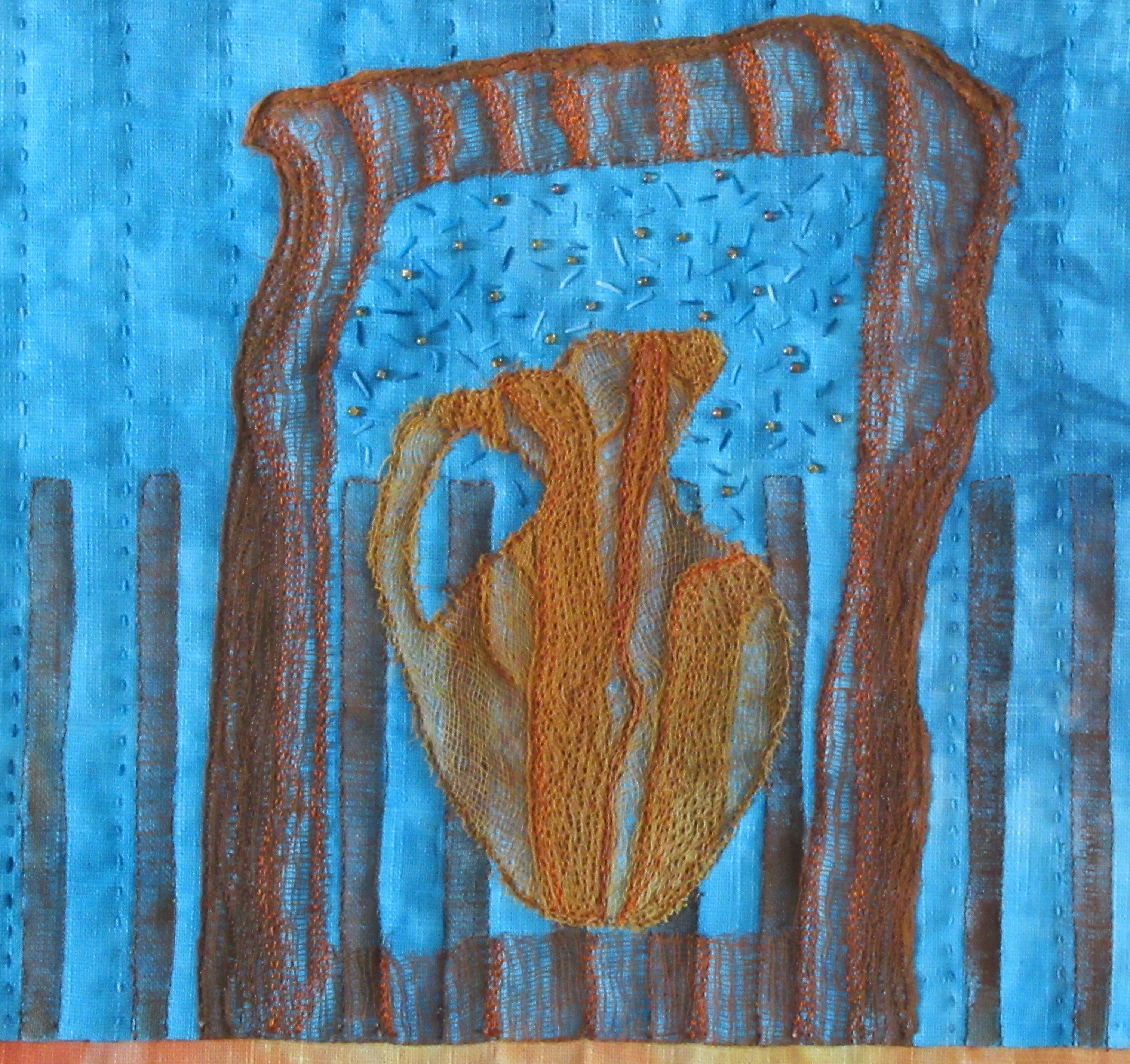
The inspiration in relation with this pottery is the archeological site of Cathage (Tunisia). Carthage is situated on a hill overlooking the sea. Hence the choice of turquoise blue, whose complementary is orange.
On the upper part : Ruins of Carthage facing the sea. The arch and pottery are cut out from several layers of folded scrim, heavily quilted. Below : small pots found into the ground when digging. They are fused on scrim and free hand embroideries are added to suggest the layers we have to dig before reaching them. Dots are stencilled with oil pastels.
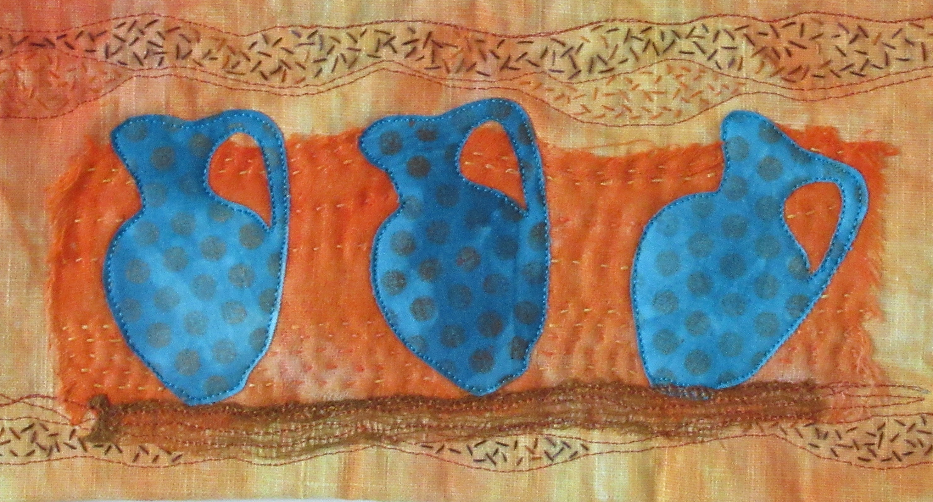
On the right : abstraction of sun rays reflections on the sea at sunset; the bars (made from my own stencils) are stencilled with acrylic paint and the round shapes with oil pastels.
All the fabrics – cotton, linen, scrim, and threads were hand dyed for this project.
Cotton and linen fabrics, acrylic paint, fused fabric art, ceramic quilting inspiration, pottery images in quilts, Middle Eastern countries inspiration, archeological excavations in Carthage, Tunisia.

Close up views:
Other pieces in the series:


A delightful design and completes your series, well done.
You have certainly created the link and I love the colours. I really lovely, cohesive series.
Thank you for your positive comment ! as you know I struggled a bit with this series !!!
I love the depth of colour you achieve with your choice of fabrics and your stenciling techniques. Your series works really well and I find all of the pieces very relaxing and peaceful. Well done
The connection between all three quilts is very clear. Cool series! I like the blending of techniques you use.
I love all the details of this piece. Lovely hand stitching. A great series, really yours, Chantal.
Good composition and choice of colors. well executed and complete perfectly your series.
A typical Chantal’s piece and you can take that a a compliment… This piece fits perfectly with the other two, love your summmerlike colours and think you’ve made a lovely series, well done.
Beautiful interpretation of this wonderful pots. I love those colors and the touch of hand quilting compliments the ancient pots. Beautiful.
It is so wonderful to see how you can recognise your style in every piece. Although you said you struggled with this series, your results are very cohesive and beautiful. I love your idea of the underground pots. Very well executed.
This piece is full of details. The dark turquoise and orange are effectively used, Showing some pottery below the ground adds interest, and the entire piece is much more effective than using a single pot. Your series has been very well thought out.
I love all the well thought out details and techniques you used. Lovely hand stitches, design and very cohesive series. Bravo Chantel!