Kaylene Maalste – D
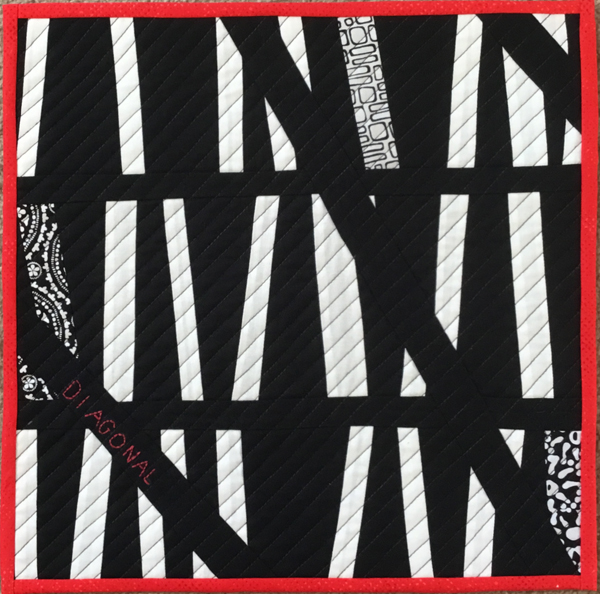
D for Diagonal
Inspiration: The diagonal line suggests movement.
Method. Carrying on with the black and white theme I used black and white white adding sections of black and white fabric used in the previous quilt. After sewing three panels I sliced across the piece in three places to give the quilt a bolder sense of movement. The word “Diagonal” is hand embroidered in the left hand strip. I quilted diagonally across the quilt with a black thread.
Detail view:


The first impression was to see the half-timbered houses. Then discover the spatiality, the depth and the movement. The introduction of the three black and white fabrics that create a further vision plane is brilliant. Excellent graphic and minimalist result.
I love this Kaylene, clean cut lines and the addition of the patterned fabric and black quilting works so well. Stunning.
I was happy to recognize your work right away. You created a lot of movement. Three small pieces of patterned fabric are the spots where the eye stops and wants to look deeper, to explore.
I also like this piece Kaylene. Like Paola at first sight I saw fragments of half-timbered houses (we have a lot of them in my area) then movement is given by the black quilting ; and the touch of red is great !
Very striking design. Love the addition of the printed fabrics, they add pizzazz to the overall picture and the eye is drawn to them immediately. There is a lot of depth in this piece. Well done.
The use of black and white as your theme continually illustrates your ability to work in a self-limited way. Diagonal – who would have thought it? The tiny bits of b&w prints add visual interest. I love it!
This is a beautiful piece, full of movement. The composition really strikes the eye. The addition of the red binding to the black and white is such a good idea and the “diagonal” red embroidery is a wonderful touch. Bravo!
Very dramatic. I like how the quilting lines are on the opposite diagonal from the piecing, also the addition of a touch of red to contrast with the black and white.
The black and white contrast is making a very striking series, and this one is no exception. I love the seemingly random way that the sections are put together and the way that the diagonal line seems to draw everything together. Well done
Another great piece in your design series! Love your use of contrast and the rhythm of diagonal design.
I love the several diagonal elements. Beautiful how you added the commercial fabrics into your quilt. I also like the little red touch and the red binding. Bravo!
Beautiful piece full of movement and clever diagonal quilting. Bravo.
At first glance it reminded me of a reflection of a skyscraper. Bold lines, dramatic design and the red binding brings it all together. Well done!
Books, that was my first thought when I saw your quilt. A strong design, because of the lines and your use of color. Love the red outlining and writing, well done!