Chantal Guillermet – P
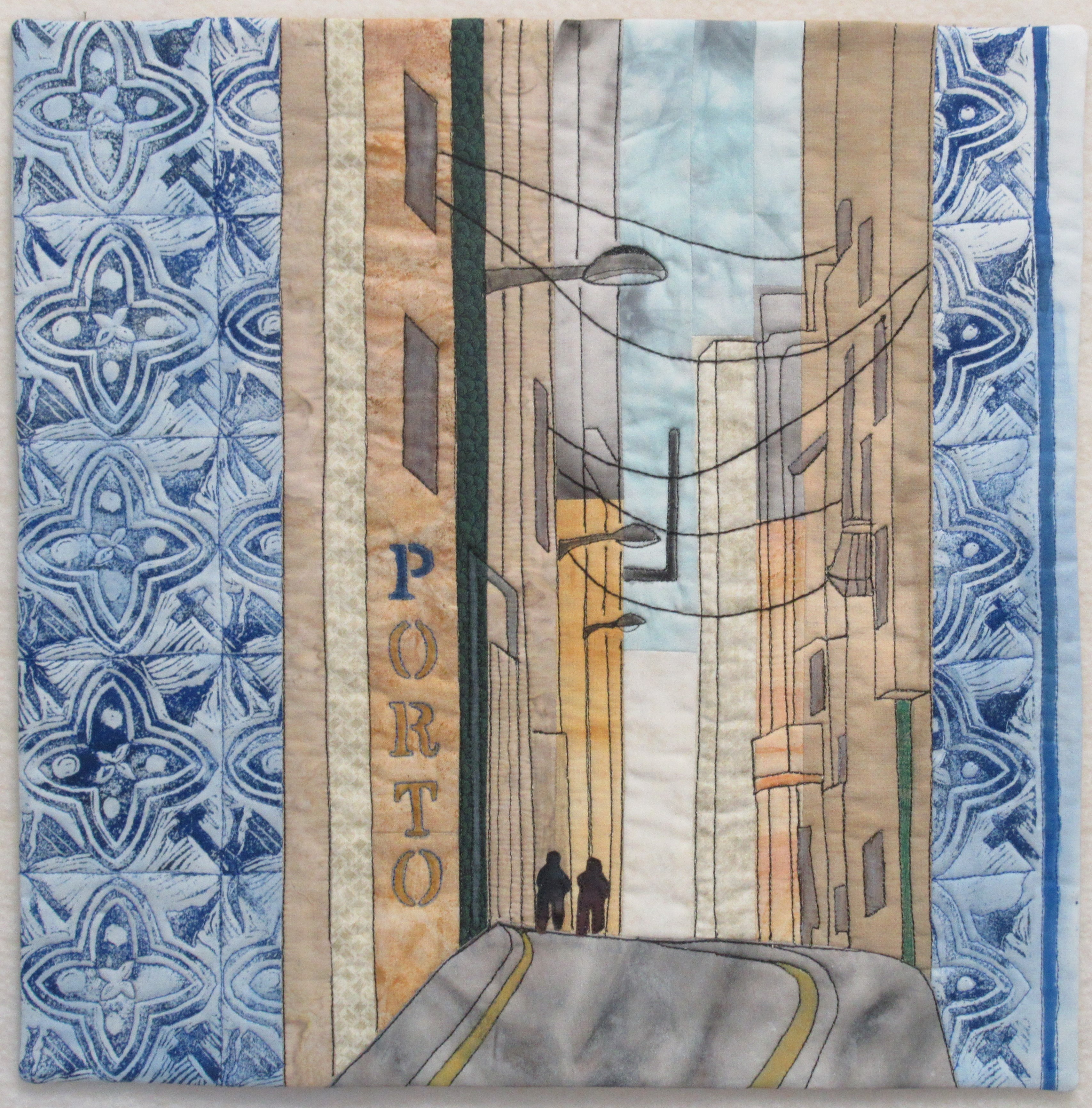
P for Porto (or Portugal)
Inspiration : The portugese city of Porto is famous for its beautiful blue Ajulejos. I gave my own vision of the place playing with the vertical lines of narrow streets and design of the traditionnal Ajulejos.
When visiting Porto I had been impressed by the walls covered by blue Ajulejos in the old town. It gave a feeling of unified decoration and discreet opulence contrasting with the austerity of dark and narrow lanes. I decided to play with this contrast and used 2 pictures : one for the Ajuleros and one for the street.
I made a linocut using the design of an Ajulejos and printed a piece of fabric with it and acrylic paint. To represent the narrow lane I worked with stripes, following more or less the colour zones on my picture and the shapes of the houses. Then the printed fabric with Ajulejos was sawn on each side of the lane, like a frame. The details – doors, windows, electric wires – have been free-motion quilted in black. The Ajulejos were outlined in blue. I used the vertical to write the name “Porto”, only ” P ” is blue, the other letters are painted with yellow ochres.
The quilt is faced.
Detail view:

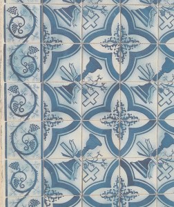
Original picture:

I like the way that you have combined the tiles and the buildings to form the street. The colours all blend really well in to each other. Lovely.
Love the mood of this piece – the colours, narrow street and azulejos capture the essence of Porto.
I love the colours and patterns in the tile work and the contrast they make with the street scene. It gives a feeling of the walking through the streets and captures the ambience. Very well done
This again is a beautiful reminder of one of your travel destinations. I too was in awe of the azulejos in Porto and you have really captured the mood of the city. Very skilled linocut, it is perfect.
I really felt I was walking down the street admiring the buildings. Superb techniques especially the lino print.
Beautiful soft colours here and a real feel of Portugal. The lino cut tile printing is particularly effective.
Beautifully done, Chantal! I admire your ability to blend multiple techniques to get an astonishing result.
I also made several pictures of the blue tiles when we visited Porto. The lino printing is very well done. This is really Porto!
The blue printed lino cuts are amazing. You are very skilled in this technique. The Ajulejos look like well matched tiles and the design is very pleasing. The vertical elements provide a good contrast. The complex linear quilting lines are very effective. The composition is very strong.
The way you build up your design is very nice. You captured the feeling of narrow streets and the desire to walk in. The ajulejos are beautiful and your linocut prints impressing. The choice of your subtle colors makes it complete. Very nice Chantal!
Thank you so much for the detailed explanation of your process. A year ago my husband and I had the great fortune to visit this fabulous country and take in all of the exquisite tile work.You have done a good job of bringing this city to life.
I feel like I am looking through a street, the perspective is spot on. Love how you incorporated the curved lino cut tiles with the linear look of the cityscape. Well done!
I love the way you worked in the printed tile. It looks fantastic. Beautiful quilt!
A magnificent piece, Chantal! The linocut tile print is a gorgeous job. The composition is very balanced and the colours are well chosen. I like the insert of the two characters and the drawing of the electric wires. I love it. Chapeau!