Chantal Guillermet – S
S for SPAIN
For the 2020 letters challenge I will choose several countries or places I have travelled to using my pictures and the appropriate letter. I would like to have a series of six quilts at the end.
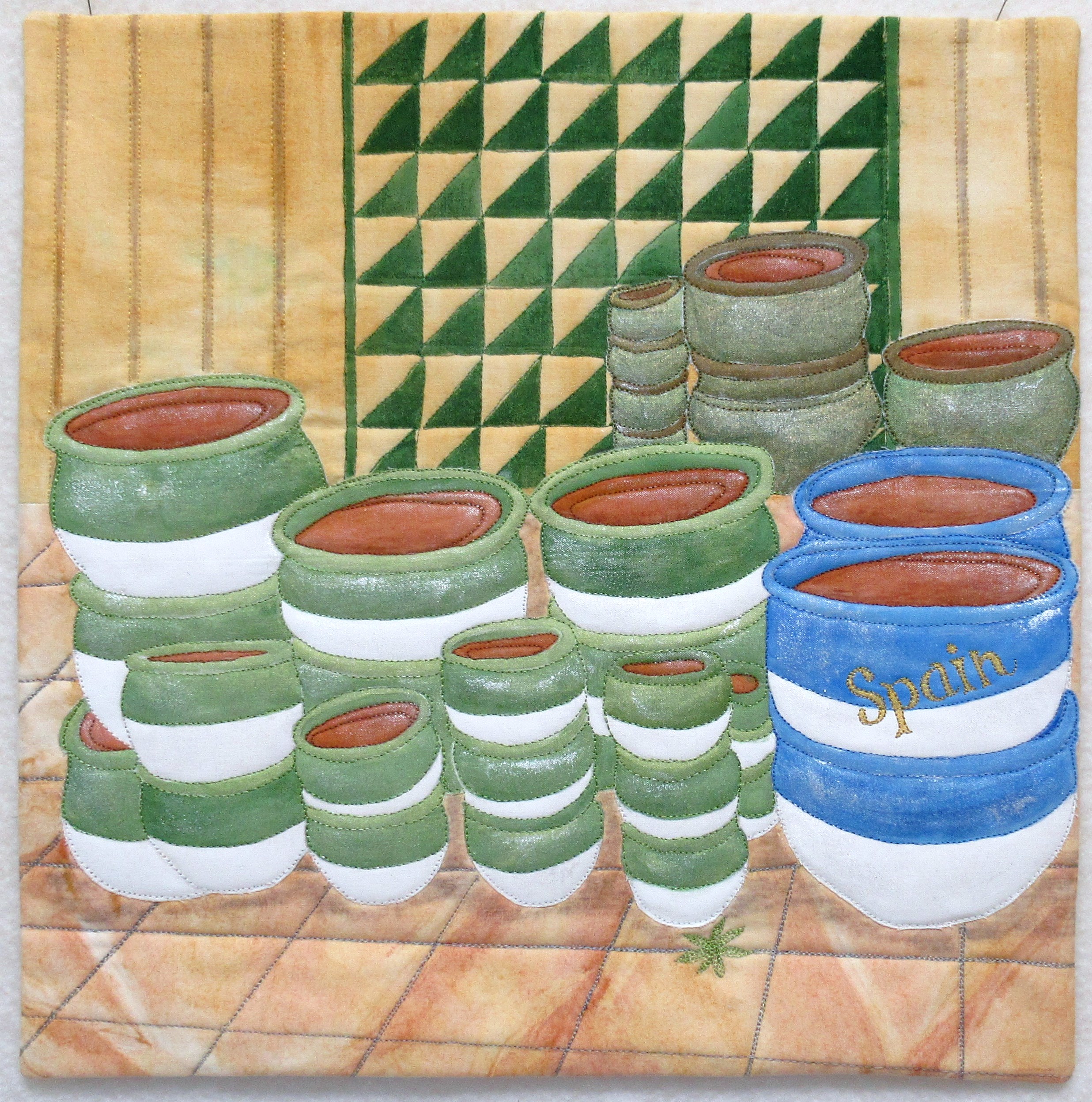
Inspiration: The letter S is for Spain. Attracted by shapes and colours I have chosen a picture from a pottery factory in La Bisbal d’Emporda in Spain. Ochres are used for the floor and wall, and acrylic paint for the pots.
I like how the piles of potteries give an interesting range of shapes.
Background and floor : I started by painting several pieces of fabric with ochres using yellow ochre for the wall and a mix of red + yellow for the tiled floor. I also wanted a link between the natural pigments and the potteries made with earth. I used a flat brush to leave marks on the surface of the fabric.
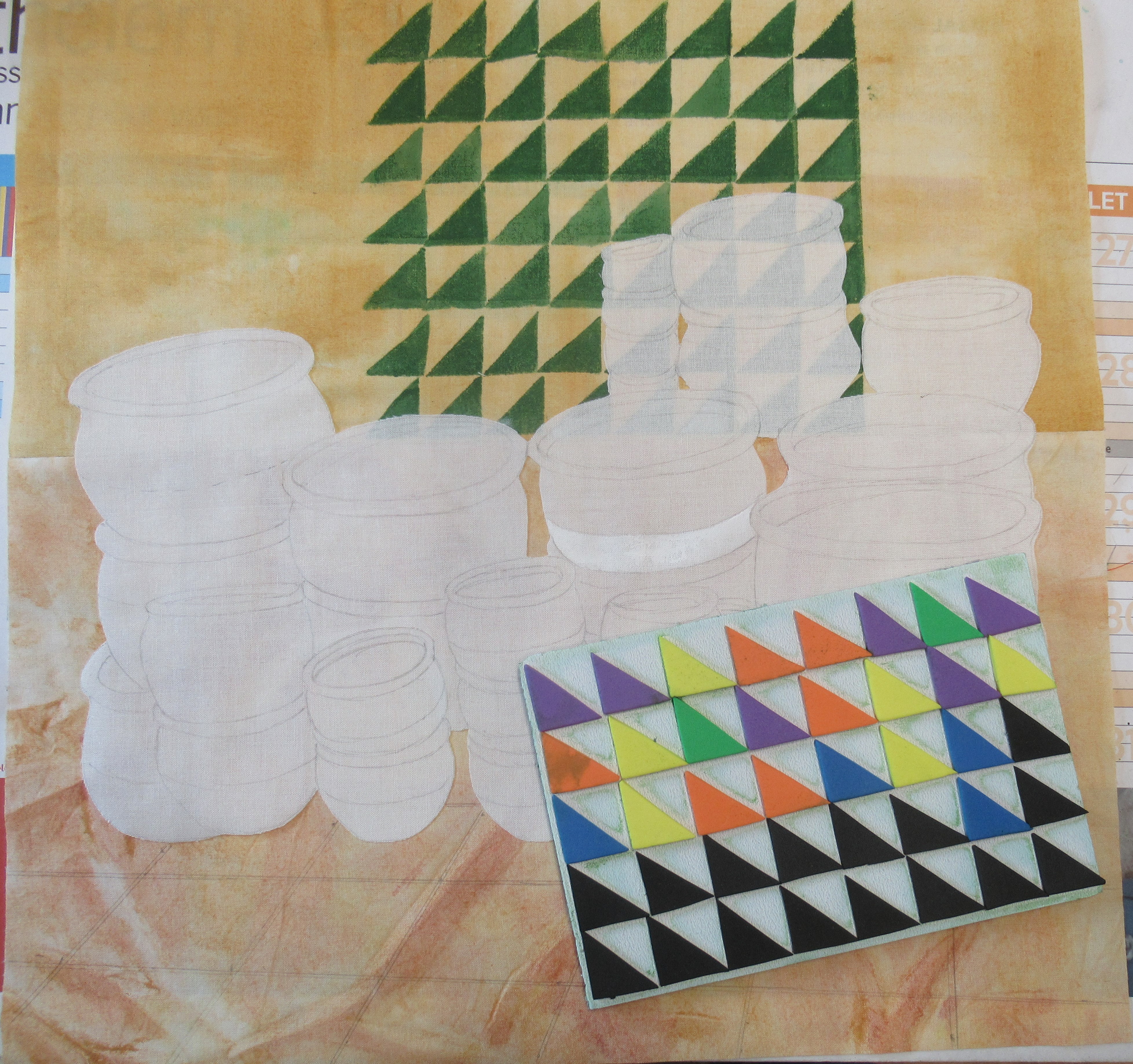
The original photo was enlarged and the pots were traced on a piece of white fabric fused on the background. I made a stamp for the tiles on the wall and printed it with acrylic paint. Pots are painted with fabric paint and ochres. I also used inktense pencils for shadows and shimmering paint for light.
I decided to write “Spain” on one of the pot like on an item in a souvenir shop.
Detail views:


Love your Spanish pottery!
When I saw the pots it had to be you Chantal. Another beautiful pottery piece in your series.
As always a nice composition and I love the ochres.
Chantal’s style is recognized immediately. Your design and colours choice is perfect. Well done.
Lovely palette of colours and I like the contrast of the shape of bowls and linear patterns.
es, it is true Chantal! Perfect composition, lovely colors. Couldn’t believe tiles on the wall were printed, not pieced.
A delightful composition and your technique and use of colours adds depth to the quilt.
Great composition and use of color. The tiles on the wall add depth of field and wonderful visual interest.
You have captured the rich colours if the floor and wall very well with your painted and stamped background, and this gives a perfect backdrop to showcase the pots. Very well executed.
Very well thought out composition. Loved how you created all the details with stamps and paints. Well done Chantal!
Nice choice of color for the composition. I love the pottery.
Your pottery looks so real Chantal, I think I would like to feel their structure in real…. Lovely composition with the floor and wall colors so natural, very nice piece!
Lovely composition and use of color. I am also drawn to stacks of pottery, especially garden sheds. The placement of a “traditional” quilt block in the background ws a delight to the eye.
A great piece made with a gentle colour palette. It’s a lovely use of your holiday photo.
Great idea to use different countries. And of course pottery! This is so yours. I like all the different techniques you used, especially the tiles on the floor. A good memory of Spain.