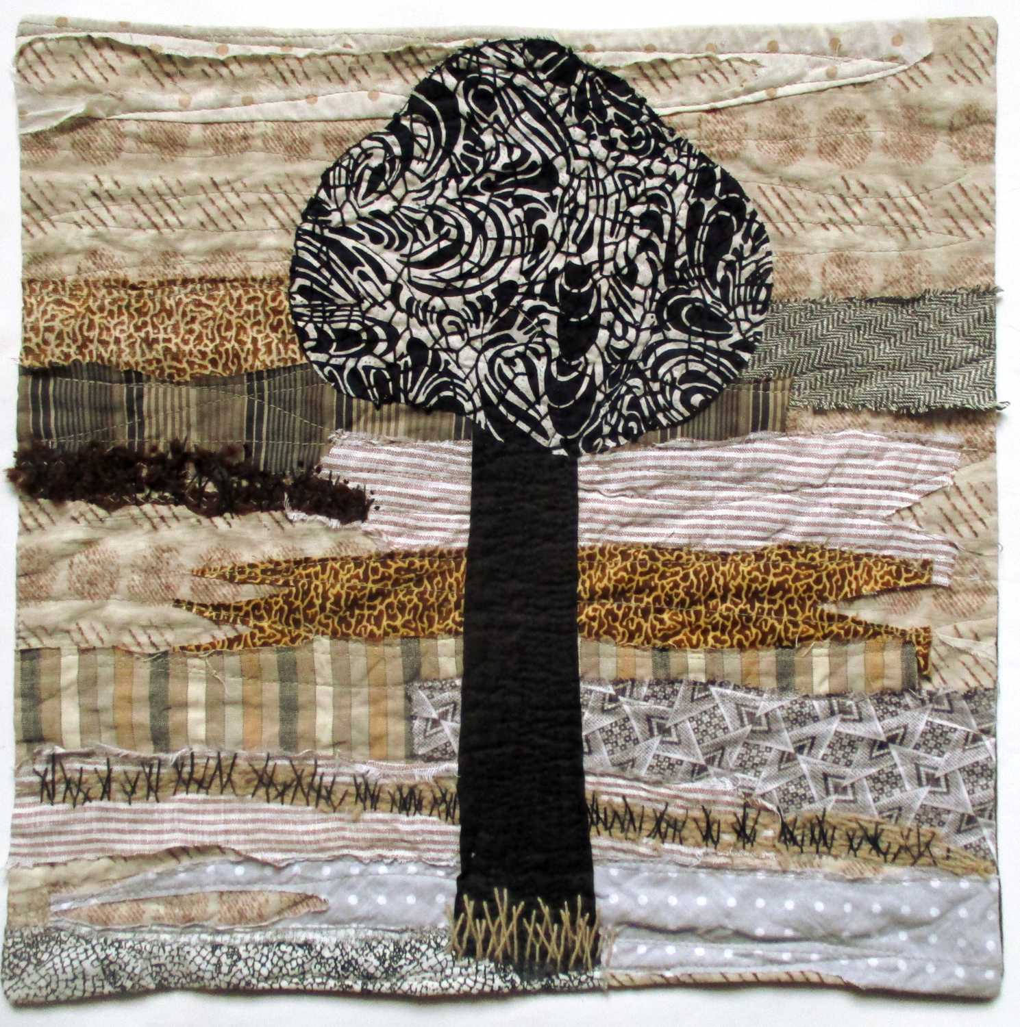
Bozena Wojtaszek – Nature #5
Tree in neutrals
Same tree as seen before in work #2 but in neutral palette. Eliminating realistic colors from the previous part of Nature pieces reminded me that similar process goes with seasons changes. Unwittingly my art follows nature’s steps.
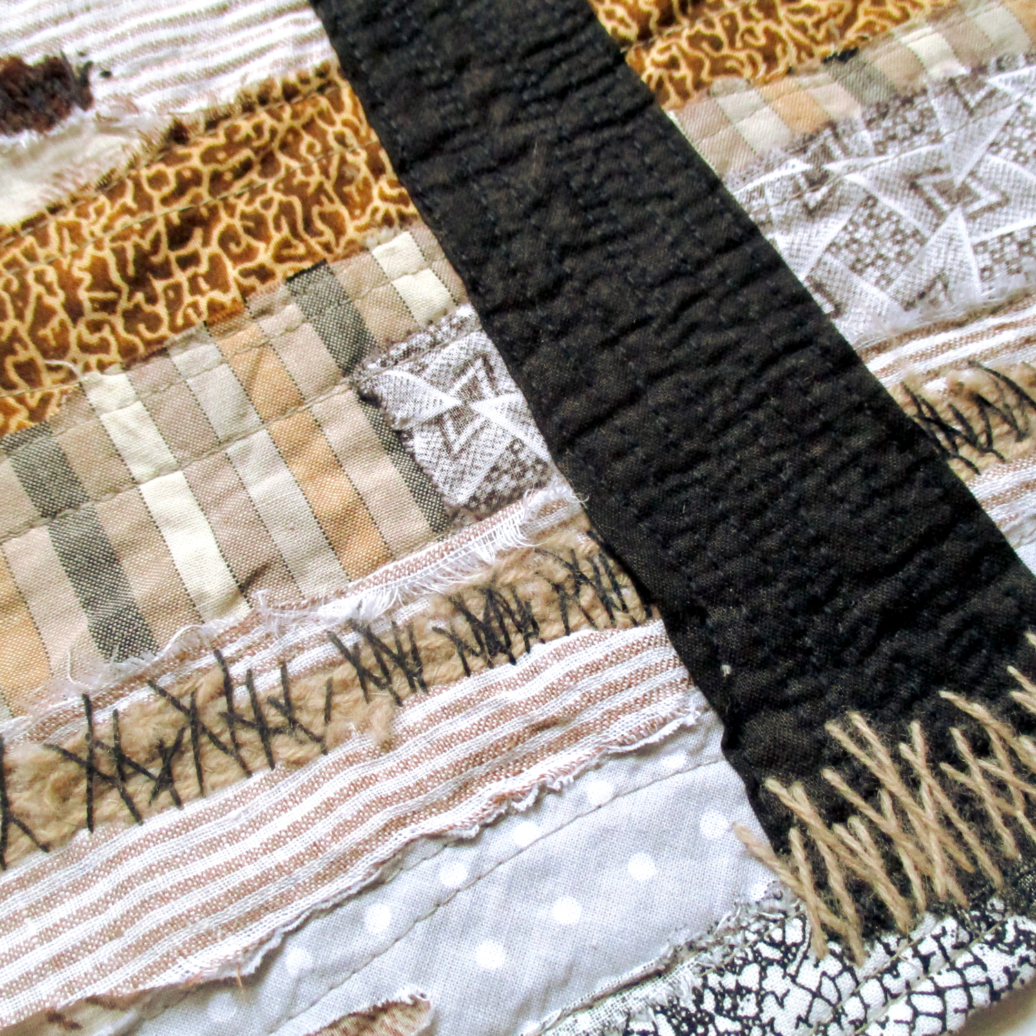
Commercial fabrics, machine applique and quilting, hand embroidery.
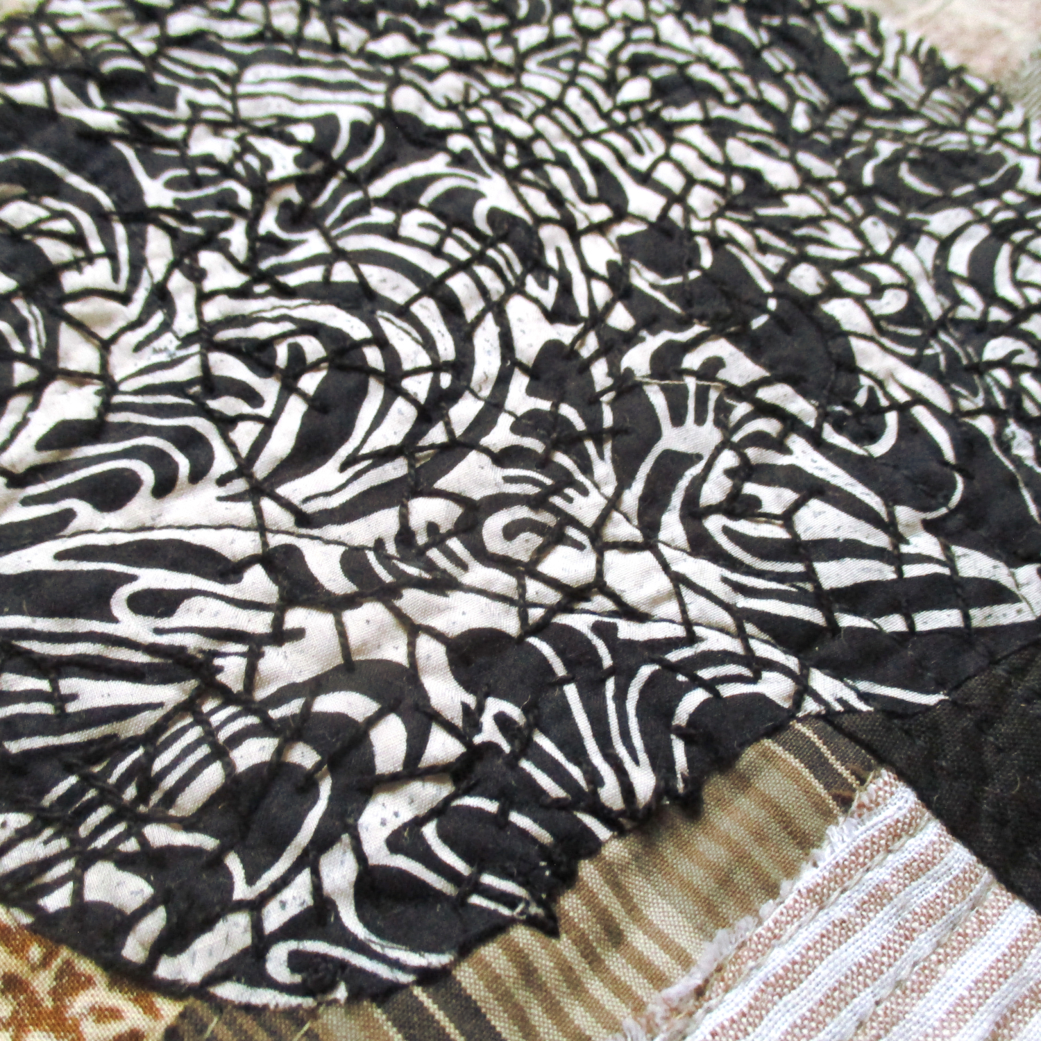

I love your palette of colors, using neutrals changes the mood and the season. What a clever idea. Great attention to details and embroidery. Bravo!
Good use of commercial fabrics covering the background. The choice of the fabrics for the tree is also very interesting.
Once again great use of a neutral palette, you have suggested the texture with the choice of the fabrics and the hand stitch really adds to this. lovely work, well done!
So nice you used the same lay-out, but now with different colors. Great texture of the background.
It is interesting to see how everything changes by changing colors. I love your addition of the hand stitching, gives more texture where it is needed.
The neutral, subtle colours off the background give this piece a completely different feeling than your previous one.
So nice to see the difference.
I like these neutral colours as well as the contrast with the tree. You ‘ve really succeeded in creating a completely different atmosphere.
Your choices of neutral colored fabrics give a feeling of change in the air, fall/winter, and it also reminds me of an old fashioned sepia toned photo. Well done.
I like the use of the neutral, monochrome palette. The textures within the fabrics create depth and detail and your hand stitching gives the final touch.
Delightful, and a great choice of colours and patterns I like the shift in your approach to the trees.
I love this neutral palette that you have used, and you’re right that this does reflect the colours of nature as the seasons progress. The textures and stitching give lovely depth and detail. Well done
Delightful to compare this quilt to your previous one. The monochromatic pallete is very effective.
I love the use of a neutral palette and the composition. Working on the same subject in different modes is a good idea.