Joan Brailsford – Architecture – The architect’s sketchbook
I found this subject very interesting, as I love to look around me at the details of buildings I see. My thought process was that rather than choose to represent a specific building, I would imagine the background work that an architect might do. Therefore my idea was to create an imagined architect sketchbook (ironic really, as I don’t make enough use of a sketchbook for my own designs!). I used a natural coloured calico as the foundation fabric, to simulate plain drawing paper, then added the features onto this.
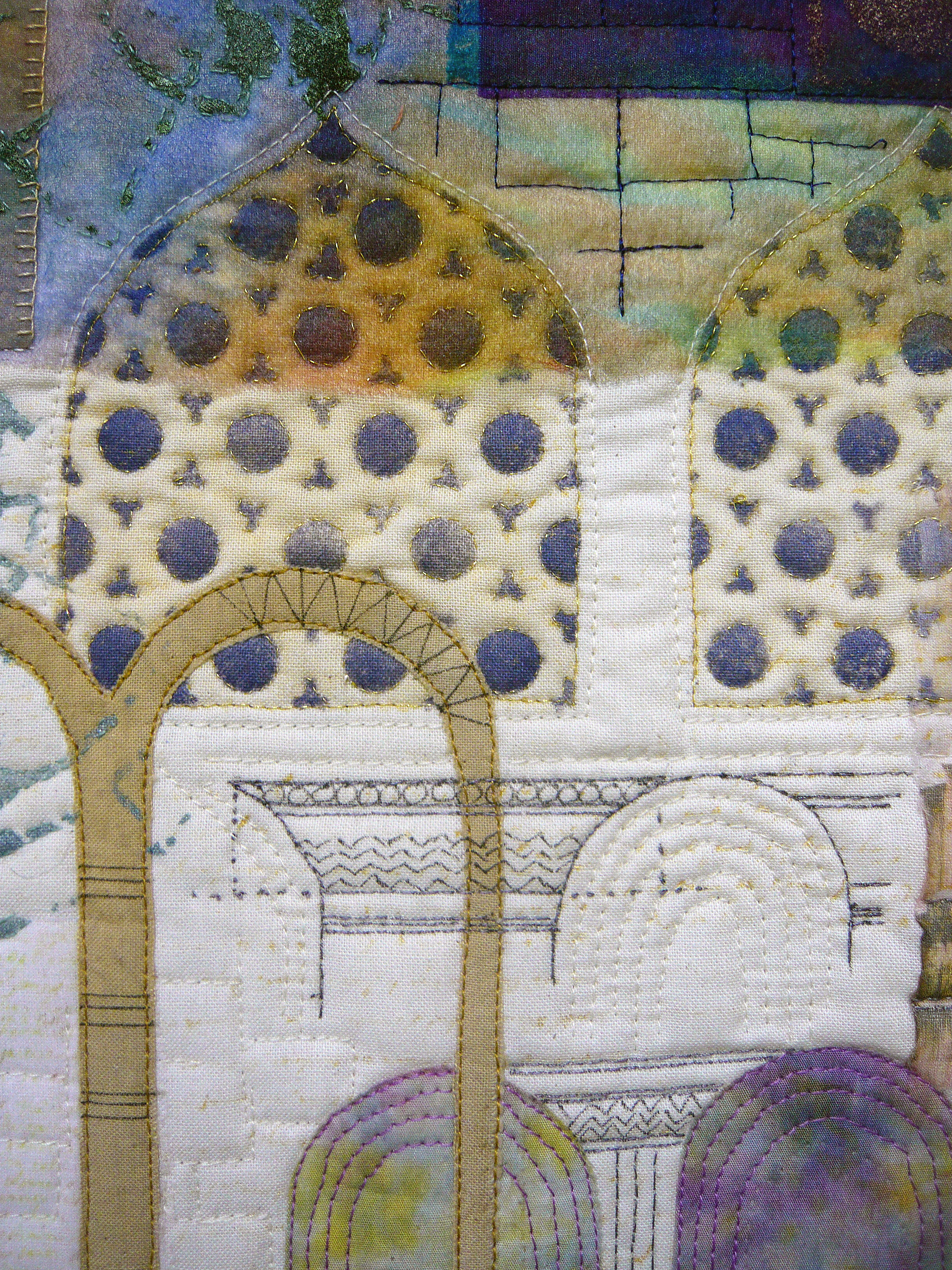
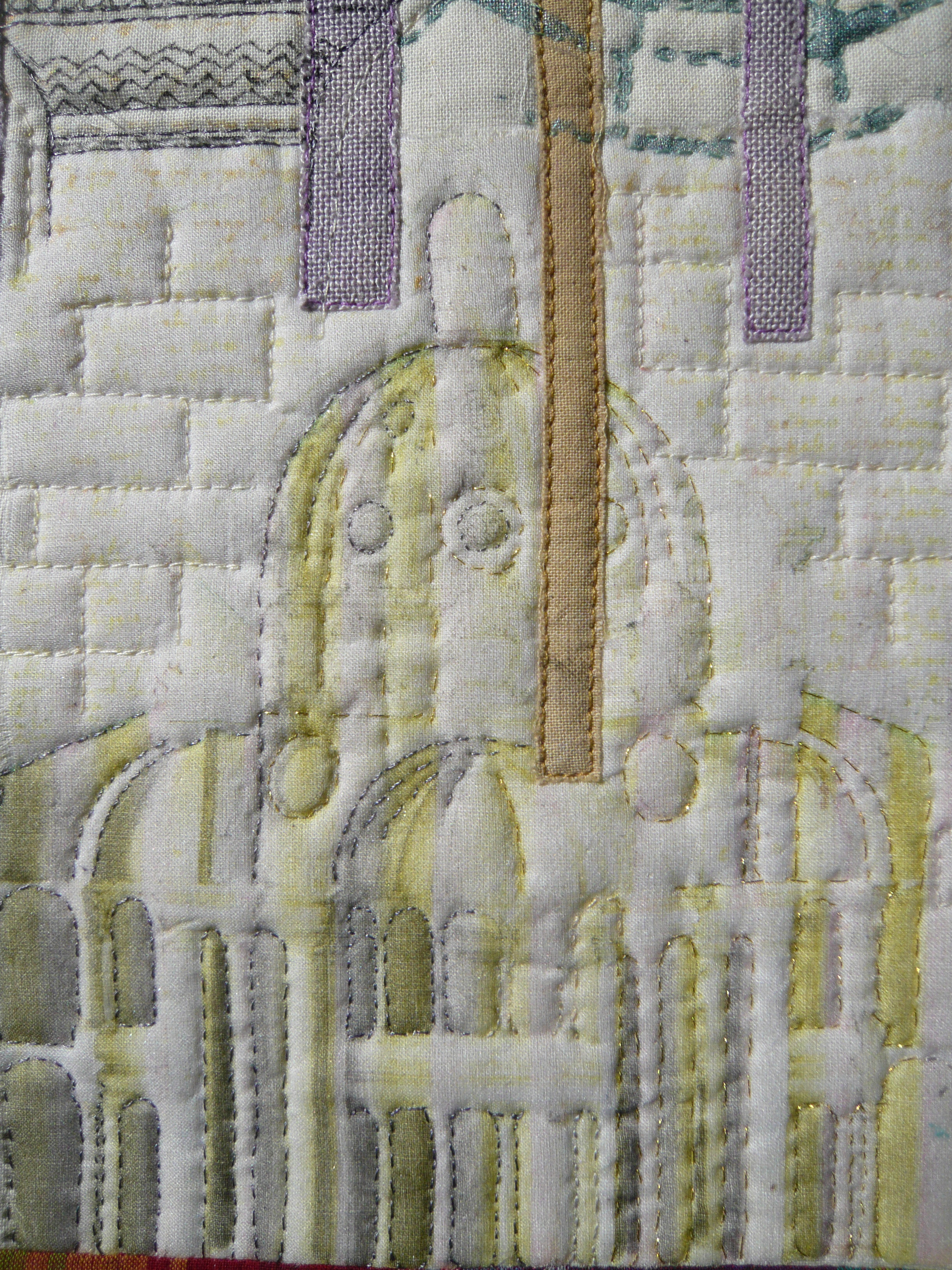
I looked at individual architectural features, including windows, archways, columns and wrought iron-work. I was very fond of a picture of a grand church, shown in a sort of cut-through detail, which seemed to fit well with my ‘sketchbook’ theme. I printed this on organza and used the shapes of the columns and arches to create other details on the piece. The column heads were drawn directly onto the calico. I added a variety of window shapes – arched, circular and ‘bell-shaped’. I added more colour at the top of the piece, as I was imagining the architect considering coloured glass as part of the window design. I used gold acrylic paint and a commercial stamp to add vague words to the background, to represent the architect’s notes and thoughts.
To fulfil the stencil brief, I created the intricate blue and gold windows using 2 commercial stencils overlaid on one another. I also used commercial stencils to create the circular patterns above these windows, and in the broken ‘wheel’ patterns that are only faint overlays to the main items. I tried, but failed, to create a stencil for the complicated wrought-iron pattern that I liked, but in the end I had to trace the pattern and cut the pattern directly from the woven Vilene which I had transfer printed dark blue..
I added machine quilting in a rough brick pattern in the spaces between features, as well as both machine and hand stitched quilting around the main features and patterns. The binding was pieced with coloured insertions and gold stamped words. The colours were included to balance the overall palette of the piece, and worked to represent the possible swatches that an architect could use.

Close up views:


Joan what a lot of work! There is so much to look at, it has worked really well.
Very striking! The layering of the repeated shapes in muted tones, accented by the blue really draws my eye, and I think captures that ‘sketchbook’ feel you were going for.
Joan your quilt is incredible ! : you may have noticed that I like doors and arches and windows as well as working in a sketchbook : your quilt represents what I like ! the different patches are very interesting by the techniques you used and by the shapes. Everything is well balanced and your work is beautiful.
Bravo, your attention to detail and then translating this into fabric with all the techniques you have used is to be congratulated.
This is wonderful. I love the sketchbook feel, and also the detailed stitching and the problem-solving that went into the design and execution.
What a terrific interpretation. Completely original. The execution of the design reflects the name. It is always fascinating to me to see inside someone’s sketchbook. Well Done!
What a beautiful piece. You realized what you were thinking of and give a whole new dimension to the sketchbook in textile. I love your windows and the colours you used, and the overall look of your work.
What a super piece love the sketchbook look and such attention to detail really wonderful
Every time I like at your piece I see more details. What a beautiful an intricate piece of work. I love it.
What a fascinating way of approaching the theme. I don’t use a sketchbook but this almost tempts me to try again. Fascinating.
Well, this architect has talent! What a beautiful piece, Joan. I keep on looking and see different things every time.First I thought it was Chantals quilt.
Absolutely my favourite in this challenge. A really well thought out layout. I wish my sketchbook looked like this. Your write up gives a really good explanation of the steps and techniques used too.