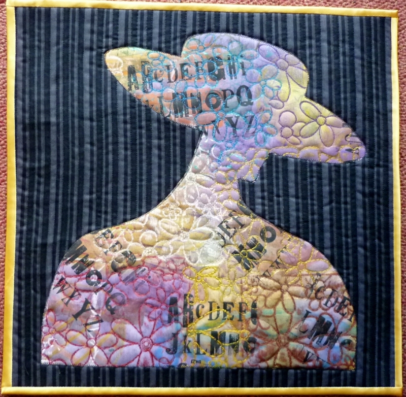
Margaret Horton – Contrast – The Hat
The inspiration for this quilt originated from an art class I attended, where I was encouraged to just paint something from a pile of art books. I chose an uncomplicated shape of a head and shoulders of a woman wearing a rather striking hat covered in fruit! The original painting in the book showed the woman’s face to be green, with her clothing and hat, a bright red. It was indeed a striking contrast. I liked the shape but the colours not so much, so I adapted it to fit a 15 x 15” space. I have left out the fruit as well.
I have always used a ‘dropcloth’ on my work surface and these cloths become very interesting over time. For the appliqué shape of the lady and hat, I have used such a cloth and have overprinted it by screen printing, stencilling and rubbings with markal paint sticks, which has given a layered effect, a favoured technique of mine at the moment.
Machine embroidery has been added to emphasise the flower shapes and also to serve to quilt the shape to the commercial print background.
As I wanted the appliqué shape to be the prominent feature, I quilted the background fabric quite simply, using the stripes as a guide. At first I used the ordinary sewing foot and straight stitch to quilt, but quickly changed to free machine embroidery because of all the fastening off that this involved.
A thoroughly good time was add and I hope you enjoy seeing the quilt.
Close up View:


Leave a comment
Comments 0