Chantal Guillermet – Series #2 – Abstract : Cubist pottery


For this second quilt of the series I had two goals to achieve : draw an abstract/cubist version of my traditional and figurative pottery and decide which complementary colors I was going to introduce in the quilt.
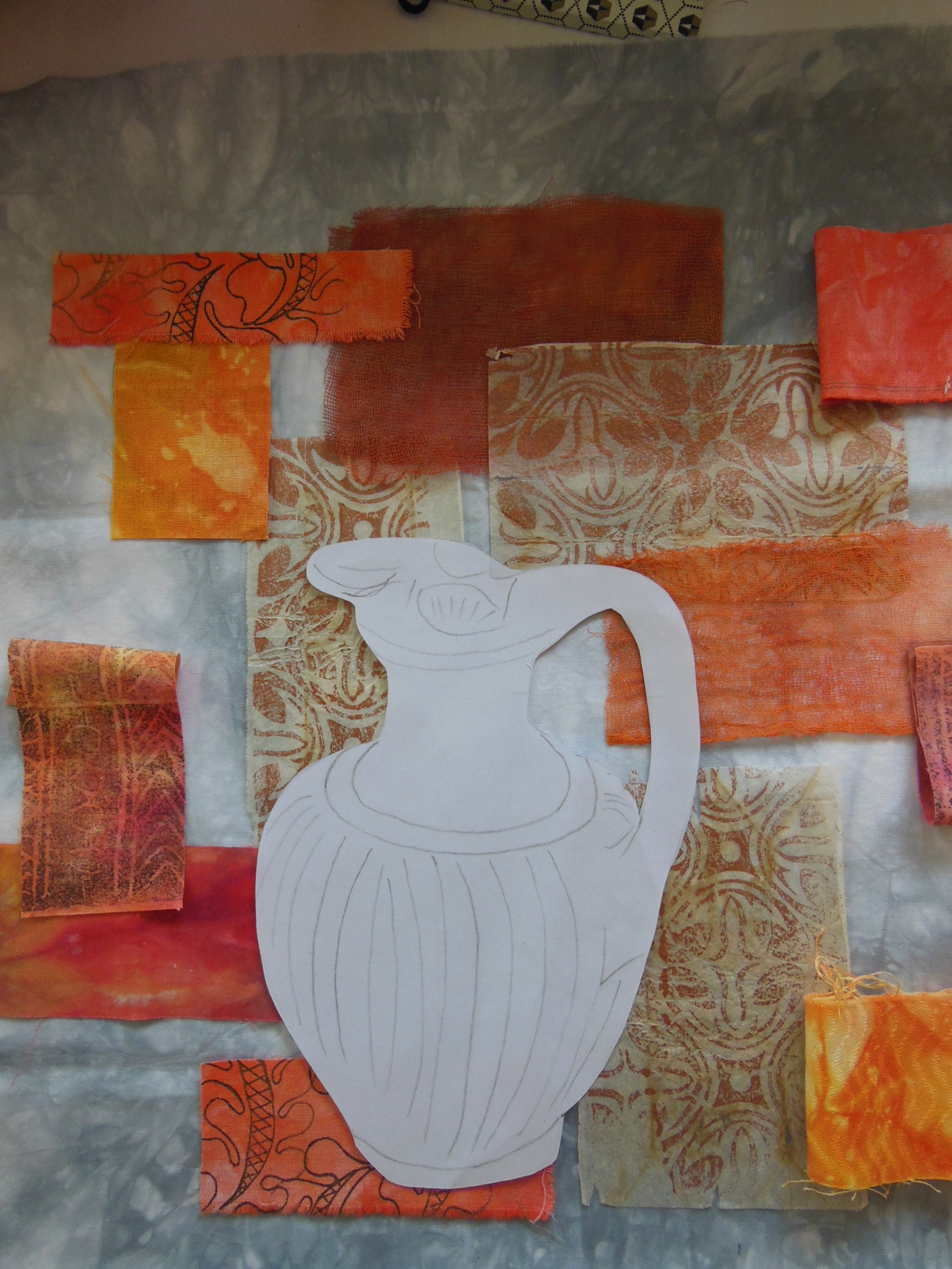
When packing for the move I did not have enough space to bring a good choice of fabrics. Instead I chose to take a box full of scraps, mainly stripes and left over prints. I discovered that I had quite a good variety of oranges and brown pieces, which was perfect for my pottery theme. So my first complementary colour will be orange. I also had a selection of printed tea bag papers. A good opportunity to use them !
I started to draw lines around and inside my pottery shape to define abstract zones. I cut them out in order to use them as templates.
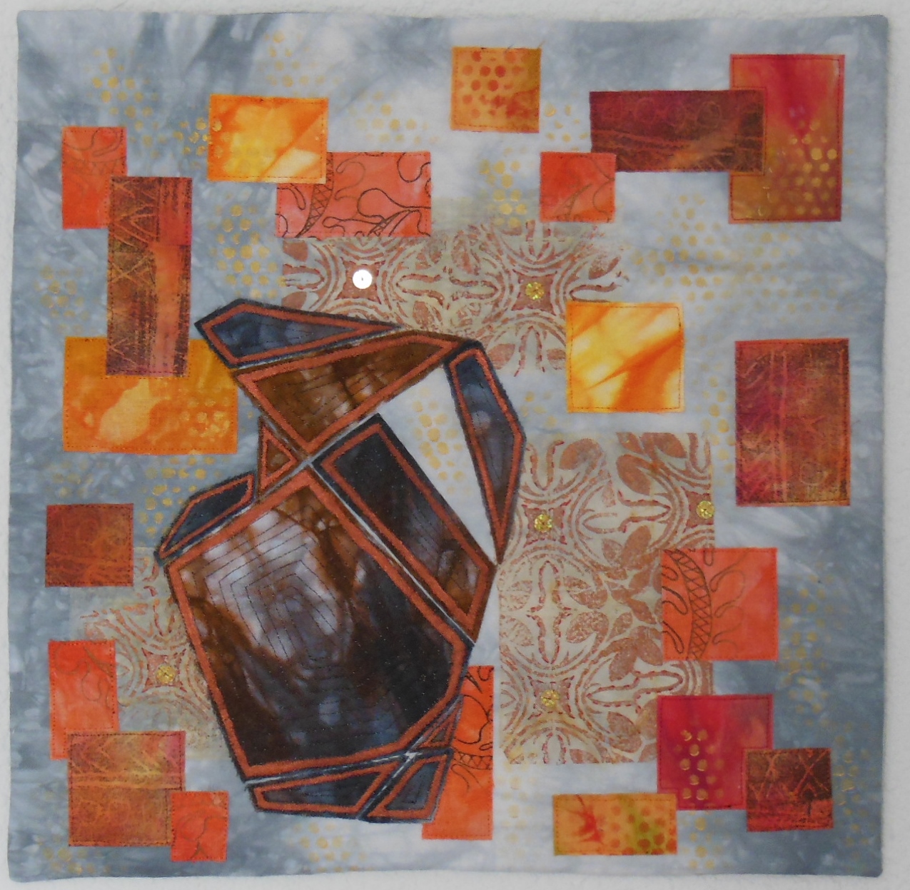
For the background I chose a neutral light grey dyed fabric. I wanted to keep the idea of a tiled wall behind the pottery. For that I randomly arranged and fused squares and rectangles chosen from my printed scraps. I also used pieces of the printed tea bag paper. The last ones were applyed with mat gel medium.. I added a bit of stencilling on the background with gold acrylic paint.
Each piece of the pottery was fused on the top of the background, and free motion quilted with echo quilting and metallic thread. At the end I outlined them with metallic paint to make them stand out.
The squares on the background are quilted with matching threads. Finally I added some hand quilting on the tea bag paper.
Cotton fabric, acrylic paint, fused fabric art, ceramic quilting inspiration, pottery images in quilts, hand printed fabrics, tea bag paper, abstraction in art quilts, fragmentation in art quilts, cubist pottery.
Series previous pieces:


A great design, I think you chose the right abstract treatment, like how you placed the background colours to reflect your original design.
This has worked really well, I especially like the way that you have constructed the jug and defined the shapes with stitching. Lovely colour combination.
The cubist transformation of the vase is successful, the choice of colours and design match very well and reflect the previous work. Bravo.
I like your colours and your abstract construction of the jug has worked well. I love the echo quilting you have used. Well done.
Such a good design for the jug. The way you did the background matches very well with your first quilt of this series.
I love the way how you “translated” the background of your first piece into this one. Very nice composition. The cubist version of the pottery is very well done. I like the quilting in it.
The lack of fabric choices seems to have worked in your favor. THe cubist vessel is great and the variety of printed backgrounds have created an antique tile look. Well done.
The way you translated your pottery to an abstract version of it is very well thought and the colors make it even stronger. Well done and a good follow up on your first piece of the series Chantal.
Beautiful work. I love the way you set out the background.
A well thought out design and a wonderful abstract. Well done.